Monday, April 4, 2016
Thursday, March 17, 2016
Thursday, March 3, 2016
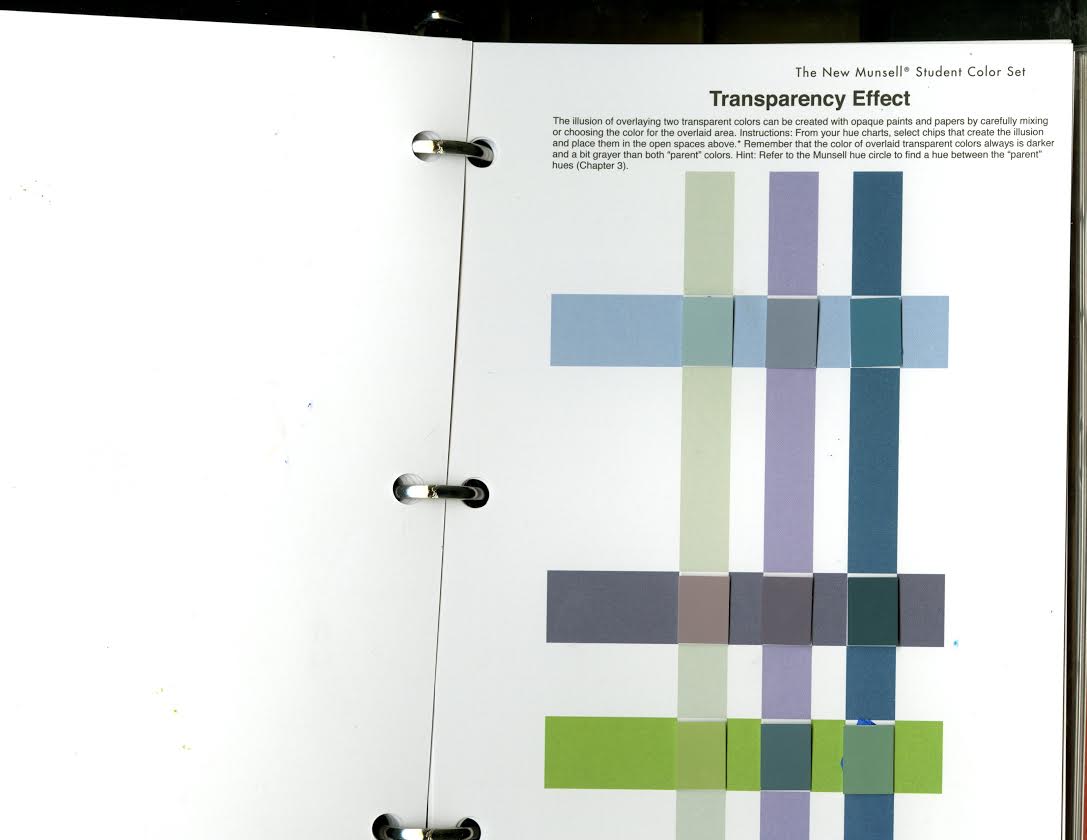
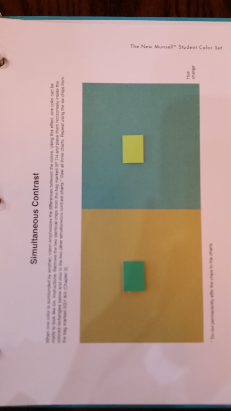
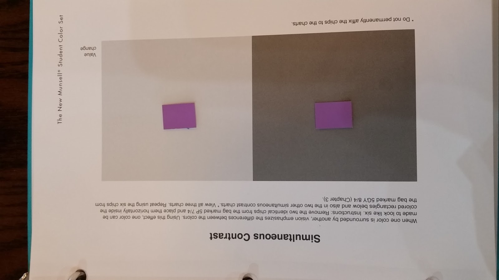
Transparency effect
"The mixture of light is always higher in value than either parent, therefore, the area where the lights overlap will be lighter."
I chose a dull yellow green and a dull yellow orange. For the yellow green I surrounded it by a green of lower chroma to pull some of the green out of the yellow green and make it look more yellow and make it look more vibrant. I surrounded the yellow orange with a vibrant orange of high chroma to dull the yellow and remove some of the orange tint out of the yellow orange.
I surrounded one of the violets with a darker violet to make it look duller and blue-ish. I surrounded the other violet with a very dull yellow to complement the violet and make it look vibrant and make it seem to have more value.
Monday, February 29, 2016
Thursday, February 18, 2016
Wednesday, February 17, 2016
Thursday, February 11, 2016
Wednesday, February 10, 2016
Wednesday, February 3, 2016
Munsel Charts
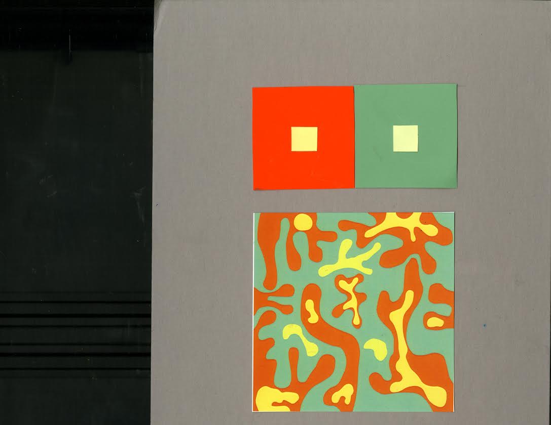
This took about 2 hours to finish. It got easier to sort the colors as I went along but harder when a lot of the colors were almost identical.
Tuesday, January 26, 2016
Lee Price is one of my favorite artists, she paints these outstanding works of art that look very photo-realistic but they do not make me feel like I am looking through a lens. She paints all of these different foods and wrappers with these different colors and patterns against a plain bedding which works very well, there is so much to look at and the viewers eye never gets tired. She could have used plain looking foods like chicken or bread but she uses these unhealthy foods with wild wrappers and packaging, to show our relationship with food, and how we eat a lot and do other things that we might be embarrassed about doing but like doing them, in private. I think all of the colors work very well together and the color of the woman's pants are a calm and subtle color, not too distracting even though she is sitting in the middle of the bed.
Subscribe to:
Comments (Atom)


