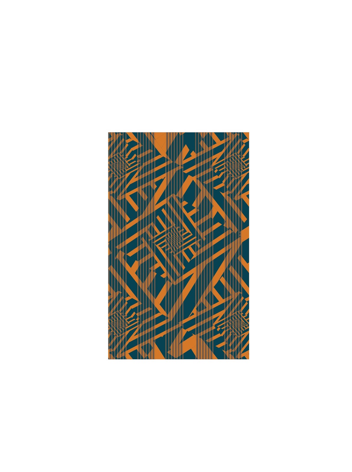
The jpeg is small on the blog so maybe make it a bit larger here. I love the pattern in the background and I think the stripes you have running vertically work pretty well. I think if you made the colors you use in the stripes were brighter than the ones used in the background, the edges would vibrate more. But I think the overall design is working pretty well.
I love the lines and the asymmetry this piece has. I think something needs to be done to make it look more as if it is vibrating but it is almost there. Maybe brighten the blue up a little.
The pattern you created has this nice spiral affect that has a lot of potential for colors clashing/vibrating together, but the vertical stripes overlaying that pattern doesn't feel necessary - those stripes feel like I'm looking through a veil to see what's behind it. I agree with Dayna that your piece would benefit from brighter colors, specifically the blue - if both colors were bright, the edges would vibrate more. Maybe you should think about making the shape of the canvas fit the pattern (so you'd be working with a diamond canvas instead of the rectangle one. The rectangle works fine, but since your pattern is so geometric I think having a non-rectilinear background could work as well.
I think your composition is very strong and I can tell the edges are vibrating. Adjusting the colors and giving them a higher chroma might make the edges vibrate even more! The way you used multiple directions of all the lines was a great choice because it gives your composition a lot of movement and in a way, spirals inward.
A strength in this pattern is definitely the composition, shapes and the radial balance. The sharp edges really make your eyes travel around the pattern. And the edges really vibrate. I think that changing the values of the colors would improve this pattern. It would also be interesting to see this pattern in a organic shape.
The jpeg is small on the blog so maybe make it a bit larger here. I love the pattern in the background and I think the stripes you have running vertically work pretty well. I think if you made the colors you use in the stripes were brighter than the ones used in the background, the edges would vibrate more. But I think the overall design is working pretty well.
ReplyDeleteI love the lines and the asymmetry this piece has. I think something needs to be done to make it look more as if it is vibrating but it is almost there. Maybe brighten the blue up a little.
ReplyDeleteThe pattern you created has this nice spiral affect that has a lot of potential for colors clashing/vibrating together, but the vertical stripes overlaying that pattern doesn't feel necessary - those stripes feel like I'm looking through a veil to see what's behind it. I agree with Dayna that your piece would benefit from brighter colors, specifically the blue - if both colors were bright, the edges would vibrate more. Maybe you should think about making the shape of the canvas fit the pattern (so you'd be working with a diamond canvas instead of the rectangle one. The rectangle works fine, but since your pattern is so geometric I think having a non-rectilinear background could work as well.
ReplyDeleteI think your composition is very strong and I can tell the edges are vibrating. Adjusting the colors and giving them a higher chroma might make the edges vibrate even more! The way you used multiple directions of all the lines was a great choice because it gives your composition a lot of movement and in a way, spirals inward.
ReplyDeleteA strength in this pattern is definitely the composition, shapes and the radial balance. The sharp edges really make your eyes travel around the pattern. And the edges really vibrate. I think that changing the values of the colors would improve this pattern. It would also be interesting to see this pattern in a organic shape.
ReplyDelete